News

google amp news

Google to Require Canonical and AMP Content to Match

by Mark Hawks December 11th, 2017

Starting February 1, 2018, Google will require parity between canonical and accelerated mobile pages (AMP) if publishers want their content to be served as AMP in mobile search results. This is to prevent publishers from using AMP “teaser pages,” incomplete pages that require users to click to the canonical page to access the full content. While AMP is not a ranking signal, having your content in AMP features like the Top Stories carousel can increase its online visibility. The stated goal of the mandate is to improve user experience with AMP.

Publishers whose content does not meet the new requirement by February 1st will receive a manual action message in Google Search Console. Google will serve users the

canonical version of the content until the publisher corrects the problem. Publishers can read Google’s AMP rules and check out the AMP open source website for guidance on producing AMP content that adheres to Google’s requirements and promotes a better user experience. 1

What Are Accelerated Mobile Pages?
google amp example in search

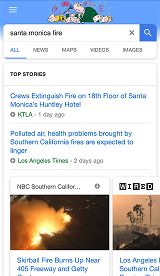
Introduced in October 2015, the Accelerated Mobile Pages Project is an open source initiative to enhance mobile browsing experience by providing users with faster, more lightweight pages. 2 Pages with AMP HTML typically use 10 times less data and load 4 times quicker than pages without it, even when heavy features like videos, graphics, and animations are included. Google has since expanded support for AMP across mobile search results.

What Was the Impetus for Accelerated Mobile Pages?

Over the past few years, the percentage of users accessing content via mobile devices has surpassed those using desktop, and the experience Google and publishers offer mobile users can be closely tied to revenue.

More than half of visitors to a mobile site will leave after 3 seconds if a page hasn’t loaded. This is a huge missed opportunity for the 75 percent of mobile sites that take 10 seconds or longer to load. 3 The median AMP load time is under 1 second. 4 Faster pages can equate to higher conversion rates for some online businesses. In one study, Walmart’s conversions increased by 2 percent for every 1 second of improvement in load time for its pages. 5 Other research has found that conversions can fall by as much as 7 percent for every 1-second delay in page load time. 6

As mobile became the dominant search device, Google ramped up its efforts to improve mobile user experience with the mobile-friendly algorithm and AMP. Recent statistics from StatCounter indicate that globally Google controls 95 percent of the volume of mobile search queries. Unsurprisingly, the company attributed mobile search as one of its main sources of revenue growth in 2016. 7

Why Do Publishers Create “Teaser Pages” for AMP?

One of the major criticisms publishers have of AMP is that users are not sent directly to their site and cannot view the URL of their content, as it would appear on their site. This is because Google caches and displays AMP content from its own server rather than those of website owners. 8 For example, a mobile search on Google serves a Top Stories carousel with results from many publishers. When you click on any of these results, “google.com” appears in the browser address instead of the URLs for the publishers’ websites. This could deter users from sharing the content or exploring other pages on a publisher’s site. 9

Some publishers might also find it easier to monetize content on their own mobile site than on AMP. This may have been the case with NBC News, which was using an AMP teaser page for its coverage of Hurricane Harvey last September. Teaser pages allow publishers to enjoy the visibility of appearing in the Top Stories carousel while also driving traffic to their sites.

Forcing a user to take additional steps and time to view your content, however, could provide a poor experience. This is the reason Google gives for the new requirement that canonical and AMP content match. Considering what a large revenue source mobile search is for the company, it’s easy to see why Google is being protective of the user experience it provides through AMP. Some in the industry have also pointed out that AMP keeps users right where Google wants them: Google.

Why Use Accelerated Mobile Pages?

When deciding to implement AMP for your website, consider the pros and cons, as well as how the feature aligns with your specific business goals.

Pros

Faster Page Load Times

As mentioned above, the median AMP load time is less than 1 second. In a SERP, a lightning bolt logo appears next to AMP content, alerting users they can expect to see the content more quickly than pages without it.

Better Rankings

Page speed is a ranking factor, so Google may serve AMP over conventional, slower mobile pages.

More Traffic

Improved visibility in search results could garner more clicks on your content, even if the traffic may or may not end up on your site.

Lower Bounce Rates

Users are less likely to abandon mobile pages that load quickly.

Higher Conversion Rates

Faster page load times typically correlate to higher conversion rates. 10

Cons

Difficult to Implement

Modifying the technical back end of pages for AMP can be challenging, and improper implementation can slow them down.

Stripped Down Pages

AMP can have fewer features than the canonical version on your website, such as logos, calls-to-action, primary navigation, and social sharing buttons.

Limited Ad Revenue

There are challenges to placing ads on AMP and revenue can be lower than if they were promoted on your own website.

Problematic Analytics Process

Although AMP supports Google Analytics, set-up is a little different.11 Also, several third-party analytics software isn’t integrated with AMP yet. Measurement is crucial to gauging the effectiveness of marketing efforts, so this could be quite a problem for sites that can’t implement adequate tracking. 12

Sources:
1 – https://webmasters.googleblog.com/2017/11/engaging-users-through-high-quality-amp.html
2 – https://marketingland.com/library/mobile-marketing-news/amp-accelerated-mobile-pages
3 – https://www.ampproject.org/learn/overview/#video
4 – https://www.searchenginejournal.com/google-amp-review-seo/209324/
5 – https://www.stonetemple.com/should-my-website-adopt-accelerated-mobile-pages-amp/
6 – https://www.searchenginejournal.com/google-amp-review-seo/209324/
7 – https://marketingland.com/goog-26-billion-q4-revenue-beats-expectations-earnings-204809
8 – https://www.semrush.com/blog/to-amp-or-not-to-amp-what-is-best-for-your-website/
9 – https://www.nytimes.com/2017/01/01/technology/google-amp-mobile-publishing.html
10 – https://www.searchenginejournal.com/google-amp-review-seo/209324/
11 – https://www.searchenginejournal.com/do-i-need-amp/181292/
12 – https://marketingland.com/tracking-accelerated-mobile-pages-amp-project-225091

Google Starts Shift to Mobile-First Indexing

by Auroriele Hans November 14th, 2016

We’ve known for a while now that more people search on mobile devices than on desktop computers. Always prioritizing user experience, Google has responded with the mobile-friendly algorithm, the expansion of Accelerated Mobile Pages, and now with a shift to primarily index mobile pages. The company announced last week that it has begun experimenting on a small scale a mobile-first index and will fully implement this method in the coming months if it proves to provide users with a better online experience.

What Does This Change Mean for Your Website?

In the near future, Google’s algorithms will mainly evaluate the mobile version of your website to rank its pages, interpret structured data, and select rich snippets to show in the search engine results pages. Failure to have a mobile-friendly website could have an unfavorable impact on your website even when it’s viewed from desktop computers. Google will still index your site, but it may not rank as favorably as mobile-friendly sites.

How Can You Prepare for a Mobile-Focused Index?

Ideally, you’ll want to have a responsive or dynamic serving website in which the main content and markup is consistent across mobile and desktop. If your website is configured so that primary content and markup varies from desktop to mobile, use the following checklist to make changes:

  • Align the structured markup for the desktop and mobile versions of your website.
  • Use the Structured Data Testing Tool to ensure your structured markup is consistent across the mobile and desktop versions of your website.
  • Make sure the structured data on your mobile site isn’t superfluous or irrelevant to the content of each page.
  • Check that Googlebot can access your mobile site with the txt testing tool.
  • Verify the mobile and desktop versions of your website in the Search Console.
  • Don’t rush to build a mobile site if it will compromise quality. Only launch a mobile site that you’re confident will satisfy users’ needs.

A Mobile Future

Mobile is clearly the direction the public is heading in the use of online services. More than 65 percent of Americans own a smartphone, and these devices are their primary means of searching the Internet. Google is committed to accommodating users’ mobile needs—and doing the same could help the continued success of your website.

To read Google’s official announcement, click here.

google mobile experience

Google Introducing Two Changes to Improve Mobile User Experience

by Auroriele Hans September 8th, 2016

Cluttered webpages and popup ads are irritating enough on a desktop, but they can be exasperating on a smartphone when you may have limited time to read a piece of content. Always striving to improve user experience, Google recently announced two changes to remove distractions from mobile search results and barriers to content on mobile pages. Both could have implications for your mobile website. 1

1. Google Says Goodbye to Mobile-Friendly Label

google-mobile-friendly-tag

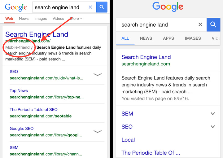
If you’ve done the work to provide smartphone and tablet users with an easy-to-navigate website, then you probably noticed a mobile-friendly label under your URL in the SERPs. Since implementing the mobile-friendly algorithm in April 2015, Google has seen widespread compliance with its mobile-friendly criteria, and the label now appears next to 85% of sites.

In an effort to streamline the search results page, or more likely to make way for the Accelerated Mobile Pages (AMP) icon, Google will no longer show the “mobile-friendly” label. Mobile-friendliness will, however, still be a ranking signal. If you haven’t done so yet, make sure your site meets the following guidelines:

  • Customize content to fit smaller screens to prevent users from having to scroll horizontally or zoom.
  • Ensure links are far enough apart so as to be conveniently tapped.
  • Choose text that will be readable without having to zoom.
  • Use software that is compatible with mobile devices. 2

You can utilize the mobile-friendly tool and mobile usability report to make sure your pages meet Google’s mobile-friendly design requirements and to spot any potential issues affecting your website.

2. Google Will Crack Down on Popups

google-mobile-pop-ups

When a user clicks on a link in the SERPs, his or her intent is to see the content described in the title and meta description, not a popup ad or intrusive interstitial, as Google calls them. Such obstacles can be frustrating, especially when they completely block content on a smartphone. After January 10, 2017, a new signal in search may make pages with four types of intrusive interstitials less accessible in the mobile SERPs:

  • Popup ads that prevent users from viewing the page after navigating to it from search or while reading it.
  • Standalone interstitials that require user action before the page can be displayed.
  • Formatting the above-the-fold part of the page to resemble a standalone interstitial and placing the content beneath the fold.
  • Interstitials asking users to install mobile apps (these were formally checked under the mobile-friendly test but will now be part of the new signal).

The new signal won’t affect some types of interstitials and elements, as long as they are not used negligently.

  • Legal notifications, such as agreements to cookie usage or age verifications.
  • Login requests for email accounts, paywall-protected content, and other forms of private content.
  • Banners that do not occupy an unreasonably distracting amount of screen space.

Prioritize Mobile User Experience

As with the recent mobile-friendly algorithm update and announcement of the planned application of AMP to all mobile search results, these two changes reflect Google’s commitment to optimizing the mobile user experience. Considering that poor user experience can lead to high bounce and low conversion rates, poor organic rankings, and negative associations with a brand, the search giant’s objective is certainly one worth incorporating into your own digital marketing strategy. 3

Additional Sources:

1 – https://webmasters.googleblog.com/2016/08/helping-users-easily-access-content-on.html
2 – https://webmasters.googleblog.com/2014/11/helping-users-find-mobile-friendly-pages.html
3 – http://blog.hubspot.com/blog/tabid/6307/bid/32307/15-Things-People-Absolutely-Hate-About-Your-Website.aspx#sm.00001hoiq1vw76dbhtuuyvmlod7cx

Google to Expand AMP Across All Mobile Search

by Jon Heinl August 5th, 2016

Mobile content consumption eclipsed desktop over a year ago, and Google has acted swiftly to accommodate user expectations, first with the mobile-friendly algorithm in April 2015 and then last spring with the launch of the Accelerated Mobile Pages Project. A collaborative effort between Google, publishers, advertisers, and tech companies, the open source initiative promises to improve the mobile web experience with lightweight, lightening fast pages. Since initially being applied only to the “Top stories” news carousel, websites from travel to entertainment have adopted AMP, and now Google plans to expand support for it across the entire mobile search results sometime this year.

Curious webmasters and website owners can get a glimpse of just what this “AMPed up” future could look like by navigating to g.co/ampdemo via their mobile devices and searching for news stories, recipes, or song lyrics. 1

Accelerated Mobile Pages: Quick and Efficient

Time is money—and so is data. In fact, 40 percent of online customers will abandon a retail or travel website if the page fails to load within three seconds. 2 AMP have the potential to offer users a quicker mobile browsing experience: not only do pages rich with graphics, videos, and animations load four times faster, but they also use ten times less data than pages lacking AMP HTML, the open framework behind the technology that can be accessed at GitHub. 3

Why You Should Consider AMP

As is usually the case with Google, the goal of Accelerated Mobile Pages is improving the search and online experience for users—this time through speedier page load times. The company is so serious about the project that it has already indexed more than 150 million AMP documents and is adding over 4 million new ones by the week. Many of these pages are the properties of Twitter, Pinterest, WordPress.com, LinkedIn, and other major players who were quick to participate in the project.

google-amp-pages

What’s good for users is often beneficial for websites and their owners, and there are several reasons businesses would want to consider “AMPing up” their content:

  • A lighting bolt logo will appear next to sites with Accelerated Mobile Pages, helping them stand out in the mobile SERPs and potentially boosting click-through rates as users opt for a faster mobile experience.
  • Faster page load times could equate to lower bounce rates and higher conversions, which could drop by seven percent with even a one-second-page response delay. 4
  • AMP isn’t a ranking factor yet, but, considering the emphasis Google places on site speed, it could very well be soon.

Head of Google News Richard Gingras said the object of the AMP project is to make the web “fast and furiously compelling.” Who wouldn’t want this for their website and content too? 5

Before You Jump on AMP

  • Weigh the potential benefits against the mobile-friendly version of your website.
  • Consider the drawbacks and cost to create an AMP version of your pages. For example, since AMP HTML is fairly new, there are still page elements that will not work with the format.

Additional Sources:

1 – https://webmasters.googleblog.com/2016/08/amp-your-content-preview-of-amped.html
2 – https://www.thinkwithgoogle.com/articles/speed-is-key-optimize-your-mobile-experience.html
3 – https://googleblog.blogspot.com/2015/10/introducing-accelerated-mobile-pages.html
4 – https://blog.kissmetrics.com/loading-time/
5 – https://www.ampproject.org/

Work With SEO Savvy Today

Learn more about how our customized digital marketing solutions can boost your organic traffic.